INFO
Displaying relations from Probability and Statistics Lecture 17 Document P3_DataVisualization in R.pdf
Question 1
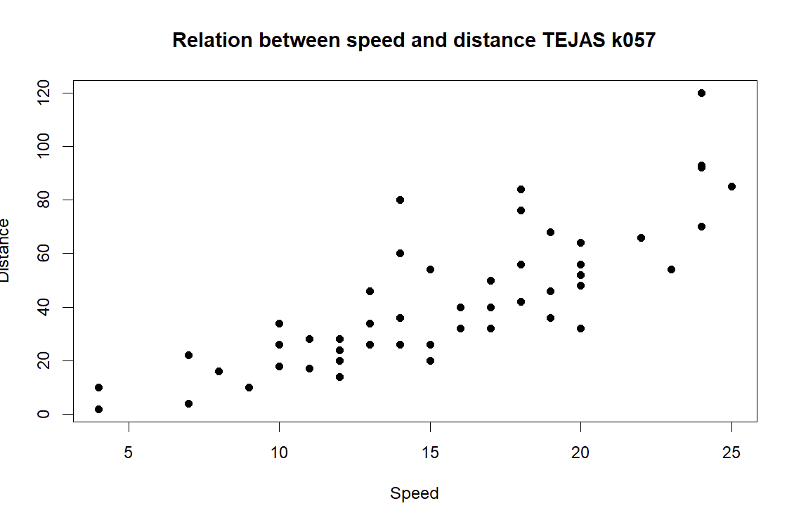
# Q1
plot (cars$speed, cars$dist,
     main = "Relation between speed and distance   ",
     xlab = "Speed",
     ylab = "Distance",
     pch=19 )
Answer 1
Question 2
# Create a factor for months
months <- factor(c("Jan", "Feb", "Mar", "Apr", "May", "Jun",
                   "Jul", "Aug", "Sep", "Oct", "Nov", "Dec"),
                 levels = c("Jan", "Feb", "Mar", "Apr", "May", "Jun",
                            "Jul", "Aug", "Sep", "Oct", "Nov", "Dec"),
                 ordered = TRUE)

# Average temperatures for a city (example data)
avg_temp_city <- c(2.0, 3.5, 7.0, 10.2, 14.0, 17.5,
                   19.8, 19.0, 15.0, 10.5, 6.5, 3.0)

# Line plot for average monthly temperatures
plot(months, avg_temp_city,
     type = "o",                     # Line and points
     col = "blue",                   # Line color
     main = "Average Monthly Temperature ",
     xlab = "Month",
     ylab = "Temperature (°C)",
     pch = 19)                       # Solid circle for points

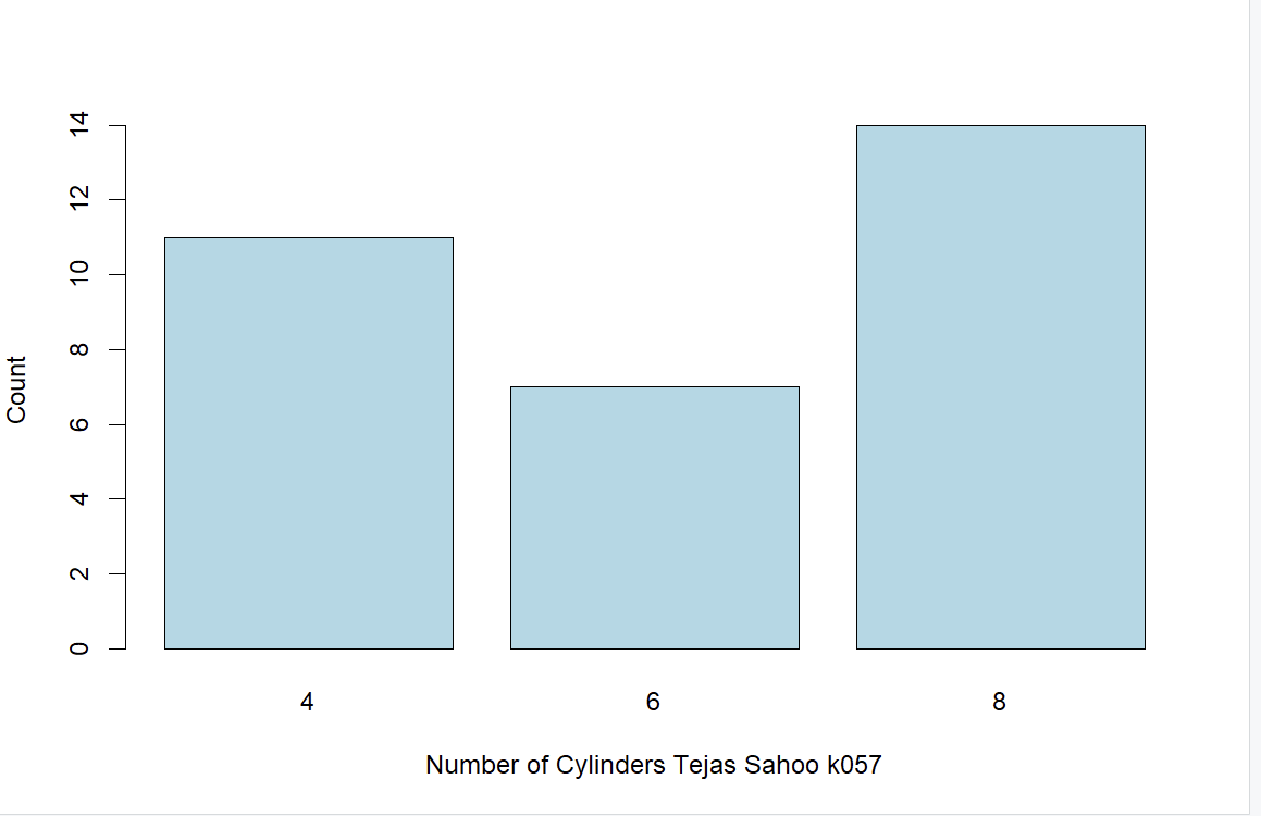
Question 3
# Count the number of cylinders
cylinder_counts <- table(mtcars$cyl)

# Create a bar plot for the cylinder counts
barplot(
  cylinder_counts,
  col = "lightblue",
  xlab = "Number of Cylinders  ",
  ylab = "Count"
)
Answer 3
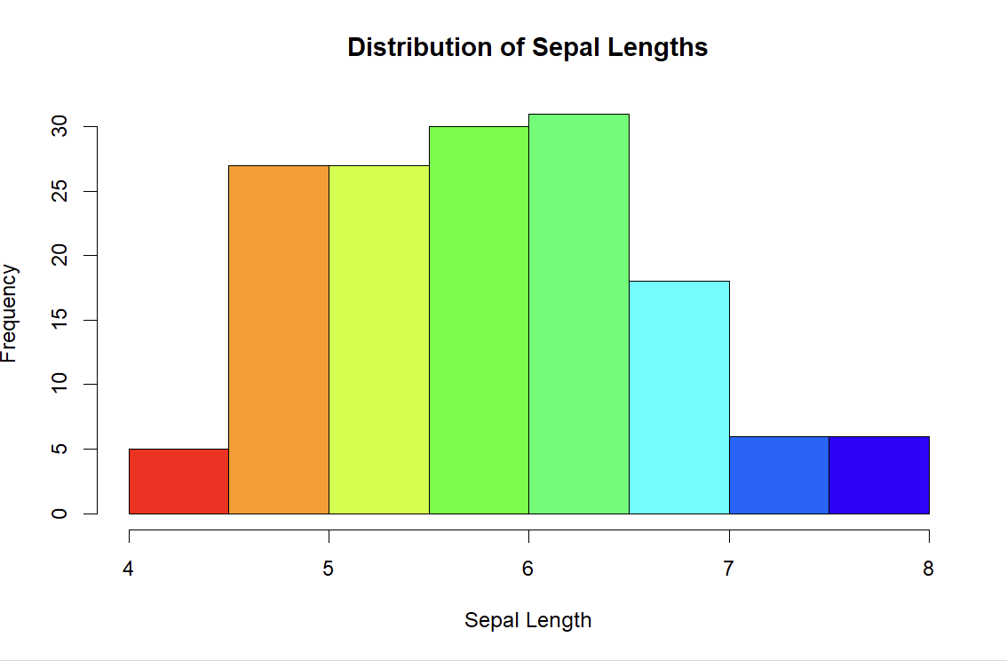
Question 4
hist(
  iris$Sepal.Length,
  col = rainbow(10),
  main = "Distribution of Sepal Lengths",
  xlab = "Sepal Length",
  ylab = "Frequency"
)
Answer 4
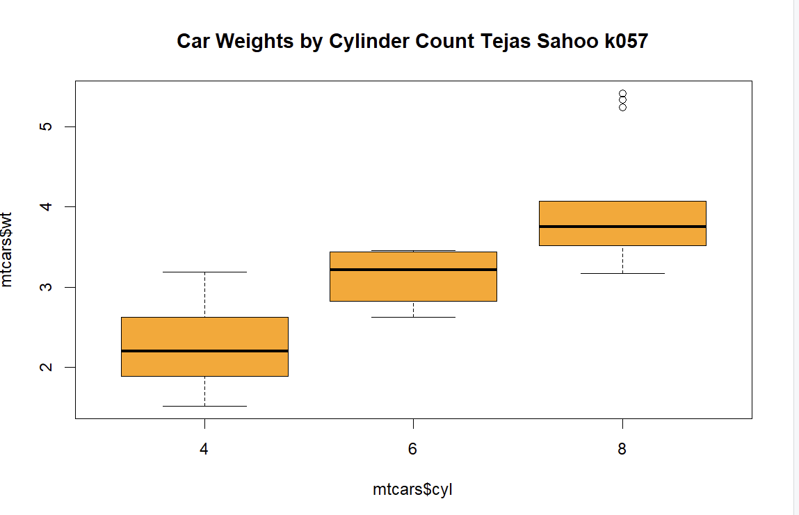
Question 5
boxplot(mtcars$wt~mtcars$cyl,
         col="orange",
         x1ab="Number of Cylinders " ,
         main="Car Weights by Cylinder Count  " )
Answer 5
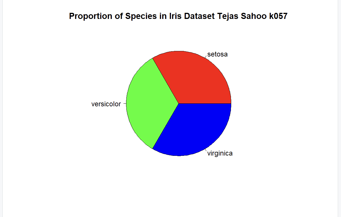
Question 6
species_counts <- table(iris$Species)
pie(
  species_counts,
  labels = names(species_counts),
  col = rainbow(length(species_counts)),
  main = "Proportion of Species in Iris Dataset  "
)
Question 8
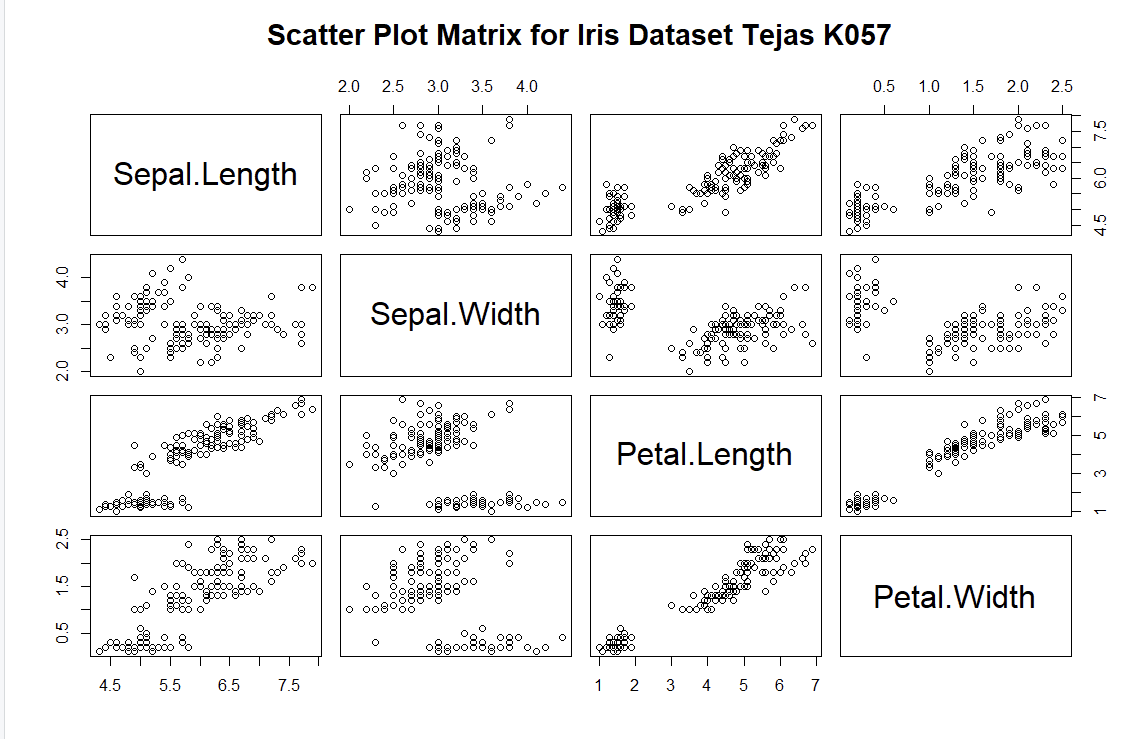
pairs (iris [1: 4],main="Scatter Plot Matrix for Iris Dataset ")Answer 8
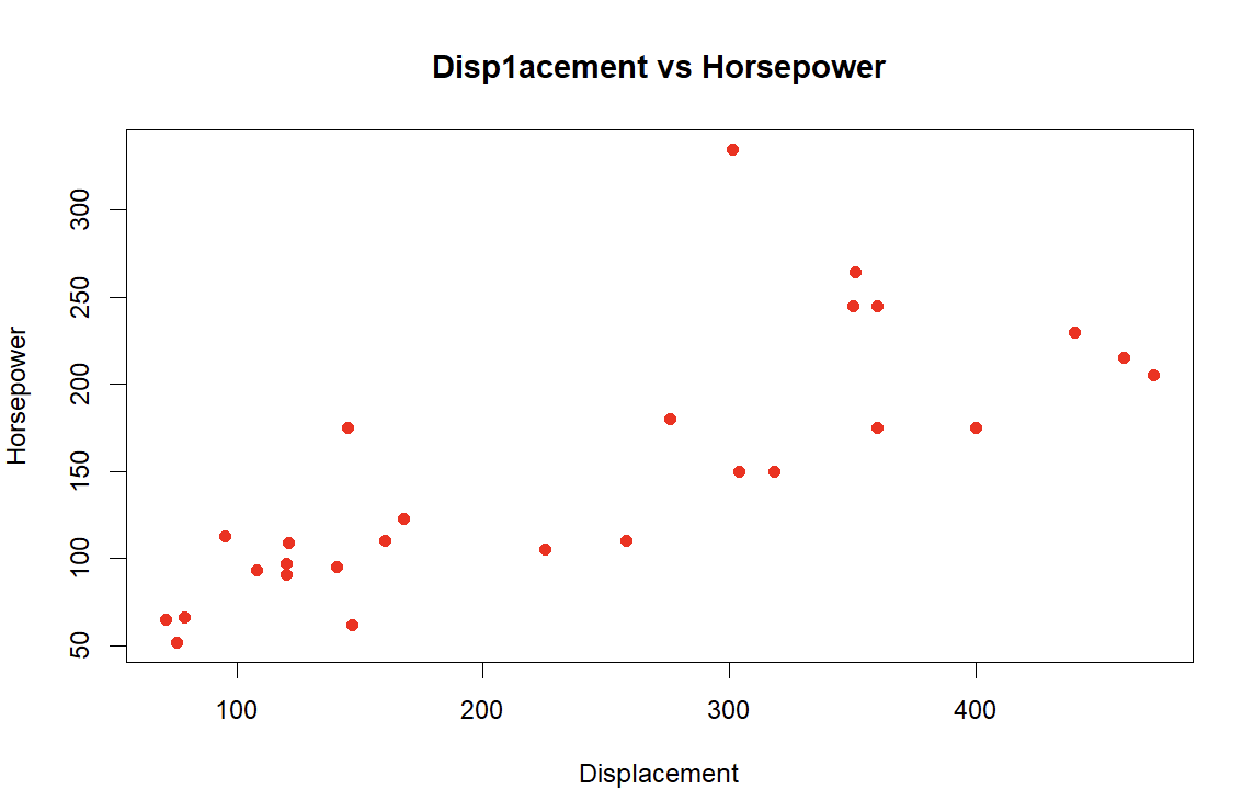
Question 9
plot(mtcars$disp, mtcars$hp,
     col="red",
     pch=19,
     xlab= " Displacement ",
     ylab= " Horsepower ",
     main="Disp1acement vs Horsepower")
Answer 9
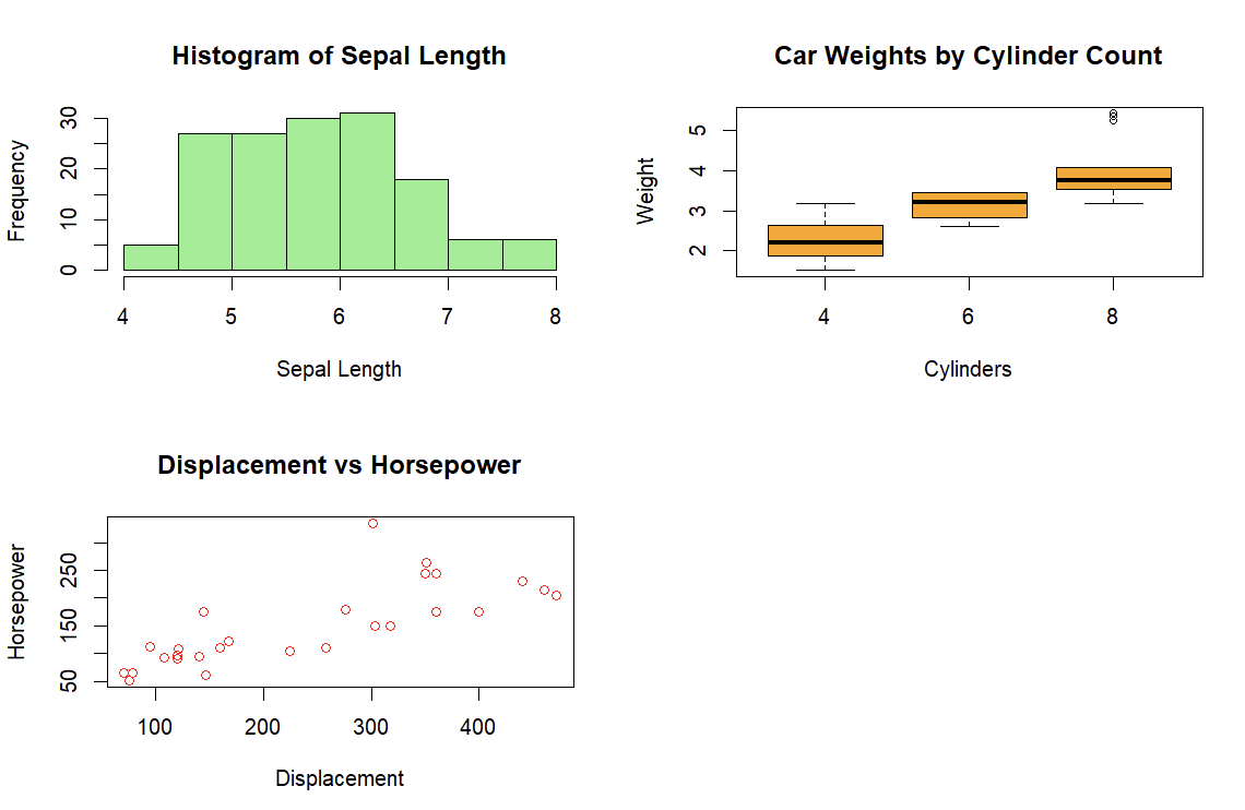
Question 10
# Set the layout for 2x2 plots
par(mfrow = c(2, 2))
#
# Histogram of Sepal Length
hist(
  iris$Sepal.Length,
  col = "lightgreen",
  main = "Histogram of Sepal Length",
  xlab = "Sepal Length"
)

# Boxplot of Car Weights by Cylinder Count
boxplot(
  mtcars$wt ~ mtcars$cyl,
  col = "orange",
  main = "Car Weights by Cylinder Count",
  xlab = "Cylinders",
  ylab = "Weight"
)

# Scatterplot of Displacement vs Horsepower
plot(
  mtcars$disp, mtcars$hp,
  col = "red",
  main = "Displacement vs Horsepower",
  xlab = "Displacement",
  ylab = "Horsepower"
)

# Line plot for Monthly Average Temperature
months <- c("Jan", "Feb", "Mar", "Apr", "May", "Jun", "Jul", "Aug", "Sep", "Oct", "Nov", "Dec")
avg_temp <- c(30, 32, 40, 50, 60, 70, 75, 73, 65, 55, 45, 35)
plot(
  months, avg_temp,
  type = "o",
  pch = 19,
  col = "blue",
  xlab = "Months",
  ylab = "Temperature",
  main = "Monthly Average Temperature"
)
Answer 10
References
Information
- date: 2025.03.16
- time: 20:30